> ## Documentation Index
> Fetch the complete documentation index at: https://docs.cosmosid.com/llms.txt
> Use this file to discover all available pages before exploring further.
# Beta diversity Overview
> What beta diversity is, why it's useful, and how the analysis turns microbial profiles into distances and ordination plots you can read.
## What is beta diversity?
In ecology, beta diversity is classically defined as the ratio between regional and local species diversity.
Put simply, beta diversity captures how much microbial community composition varies across samples or cohorts, for example between gut samples from different people or body sites. It shows how the microbiome shifts across environments or conditions.
Beta-diversity analysis measures this shift using distance metrics. Each metric takes two microbiome feature profiles (for example, the relative abundance profiles of two patient samples) and computes a single value whose magnitude reflects how far apart they are. Applied to every pair of samples in a cohort, the metric produces a matrix holding the distance between all possible pairs of profiles.
In microbiome publications, beta-diversity results are most often presented as ordination plots. An ordination plot takes the matrix of pairwise distances and turns it into a map, where each sample is a point and the spacing between points reflects how different the samples are. Several ordination methods exist, each converting the distance matrix into coordinates in a slightly different way.
Points in an ordination plot can then be annotated with colors and shapes. This makes it easy to see whether a variable, such as treatment, disease status, or body site, is associated with the differences between microbial communities.
What's the difference between alpha and beta diversity?
**Alpha diversity** measures the diversity within a single sample, a quantitative way to describe how rich and varied the microbial community in that sample is. Each sample gets its own value, so you can compare communities the way you would compare any other measurement, for example pH or cell count.
**Beta diversity**, by contrast, measures how different two microbial communities are, offering a way to compare complex microbial profiles. Imagine trying to compare two profiles, each with hundreds of taxa at different abundances, by reading down two columns of numbers. Beta diversity does that comparison for you and returns a single distance for every pair of samples. It calculates this difference using a range of metrics (e.g: Bray-Curtis, Jaccard, Aitchison), and the metric you choose determines which features carry the most weight in the comparison.
## Why is it useful?
Beta-diversity analysis lets you see how different samples are from one another, and once the points are annotated with colors or shapes, whether those differences line up with a variable you are visualizing, such as treatment, disease status, body site, or time point.
For biological discovery, it can separate conditions that look clinically similar but differ in community structure, track how far a community is pushed from baseline after a perturbation such as antibiotics and whether it recovers, judge intervention success such as a recipient community moving closer to its donor after a fecal transplant, or check whether samples from treatment responders and non-responders group apart.
Beta diversity is also useful for quality control: it can flag outlier samples that may signal low sequencing depth or contamination, expose mislabeled samples when known-similar ones fail to group together, and reveal batch effects when samples cluster by sequencing run rather than by biology.
## How does it work?
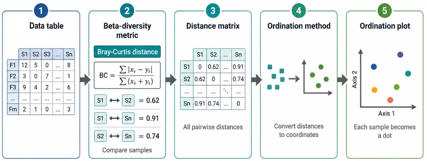 Beta-diversity analysis moves from your raw data table to a plot in five steps. Each step feeds the next, following the figure from left to right.
**Step 1. Feature table.** The input is a **Data Table**: a grid where each column is a sample (S1, S2, ... Sn) and each row is a feature, such as a taxon or gene (F1, F2, ... Fm). Each cell holds how abundant that feature is in that sample. This table is the numerical profile of every sample in your cohort.
**Step 2. Beta-diversity metric.** A **beta-diversity metric** compares two samples at a time and returns a single number: the **distance** between them. A small value means the two communities are similar, a large value means they are different. In the figure, the Bray-Curtis metric gives a distance of 0.62 between S1 and S2, and 0.91 between S1 and Sn. Cosmos-Hub 2.0 supports 23 metrics, and your choice decides which features carry the most weight in the comparison (see [how to choose a metric](/beta-diversity-on-the-dap)).
**Step 3. Distance matrix.** The metric is applied to every possible pair of samples, and all of those values are collected into a **distance matrix**. Each cell is the distance between one pair of samples, and the diagonal is 0 because a sample compared to itself has no difference. This matrix holds the full result, but it is hard to read by eye, especially with many samples.
**Step 4. Ordination method.** An **ordination method** takes the distance matrix and converts it into coordinates in 2D or 3D space, placing similar samples close together and different samples far apart. Several methods exist, and Cosmos-Hub 2.0 offers four of them (see the table below).
| Method | What it shows | When to use it | How to read it |
| :-------- | :--------------------------------------------------------------------------------------------- | :------------------------------------------------------------------------------------------------------------------------- | :------------------------------------------------------------------------------------------------------------------------------------ |
| **PCoA** | The main differences in community composition between samples. | The standard starting point for beta-diversity analysis, especially when you want a clear view of whether groups separate. | Closer samples are more similar; samples far apart are more different. The axes indicate how much variation the plot captures. |
| **MDS** | Whether the distances between samples in the plot match the original beta-diversity distances. | When you want another direct view of sample-to-sample differences, or to confirm patterns seen with PCoA. | Similar to PCoA, but samples are placed so plotted distances reflect the original distance matrix as closely as possible. |
| **t-SNE** | Small clusters or subgroups of samples. | When you suspect the dataset contains distinct community types that aren't obvious in PCoA. | Good for exploring clusters, but don't over-interpret the distance between far-apart groups, since it is mainly a visualization tool. |
| **UMAP** | Clusters, gradients, and non-linear patterns in microbial communities. | Larger or more complex datasets where samples may form subgroups or gradual transitions. | Useful for exploration, but confirm apparent clusters with metadata, biological context, and statistical testing. |
**Step 5. Ordination plot.** The final output is an **ordination plot**, where each sample becomes one dot. Dots that sit close together have similar communities, and dots far apart are more different. The axes tell you how much of the variation the plot captures. You can then color or shape the dots by metadata, such as treatment or body site, to see whether a variable is associated with the differences between samples.
To run beta diversity in Cosmos-Hub 2.0, including the plots and tables it produces, how to read them, and the parameters you can tune, see [Beta diversity on Cosmos-Hub 2.0](/beta-diversity-on-the-dap).
Beta-diversity analysis moves from your raw data table to a plot in five steps. Each step feeds the next, following the figure from left to right.
**Step 1. Feature table.** The input is a **Data Table**: a grid where each column is a sample (S1, S2, ... Sn) and each row is a feature, such as a taxon or gene (F1, F2, ... Fm). Each cell holds how abundant that feature is in that sample. This table is the numerical profile of every sample in your cohort.
**Step 2. Beta-diversity metric.** A **beta-diversity metric** compares two samples at a time and returns a single number: the **distance** between them. A small value means the two communities are similar, a large value means they are different. In the figure, the Bray-Curtis metric gives a distance of 0.62 between S1 and S2, and 0.91 between S1 and Sn. Cosmos-Hub 2.0 supports 23 metrics, and your choice decides which features carry the most weight in the comparison (see [how to choose a metric](/beta-diversity-on-the-dap)).
**Step 3. Distance matrix.** The metric is applied to every possible pair of samples, and all of those values are collected into a **distance matrix**. Each cell is the distance between one pair of samples, and the diagonal is 0 because a sample compared to itself has no difference. This matrix holds the full result, but it is hard to read by eye, especially with many samples.
**Step 4. Ordination method.** An **ordination method** takes the distance matrix and converts it into coordinates in 2D or 3D space, placing similar samples close together and different samples far apart. Several methods exist, and Cosmos-Hub 2.0 offers four of them (see the table below).
| Method | What it shows | When to use it | How to read it |
| :-------- | :--------------------------------------------------------------------------------------------- | :------------------------------------------------------------------------------------------------------------------------- | :------------------------------------------------------------------------------------------------------------------------------------ |
| **PCoA** | The main differences in community composition between samples. | The standard starting point for beta-diversity analysis, especially when you want a clear view of whether groups separate. | Closer samples are more similar; samples far apart are more different. The axes indicate how much variation the plot captures. |
| **MDS** | Whether the distances between samples in the plot match the original beta-diversity distances. | When you want another direct view of sample-to-sample differences, or to confirm patterns seen with PCoA. | Similar to PCoA, but samples are placed so plotted distances reflect the original distance matrix as closely as possible. |
| **t-SNE** | Small clusters or subgroups of samples. | When you suspect the dataset contains distinct community types that aren't obvious in PCoA. | Good for exploring clusters, but don't over-interpret the distance between far-apart groups, since it is mainly a visualization tool. |
| **UMAP** | Clusters, gradients, and non-linear patterns in microbial communities. | Larger or more complex datasets where samples may form subgroups or gradual transitions. | Useful for exploration, but confirm apparent clusters with metadata, biological context, and statistical testing. |
**Step 5. Ordination plot.** The final output is an **ordination plot**, where each sample becomes one dot. Dots that sit close together have similar communities, and dots far apart are more different. The axes tell you how much of the variation the plot captures. You can then color or shape the dots by metadata, such as treatment or body site, to see whether a variable is associated with the differences between samples.
To run beta diversity in Cosmos-Hub 2.0, including the plots and tables it produces, how to read them, and the parameters you can tune, see [Beta diversity on Cosmos-Hub 2.0](/beta-diversity-on-the-dap).