Donut Graph
What is a donut graph?
A donut graph is a circular visualization of the organisms identified, shown one taxonomic level at a time.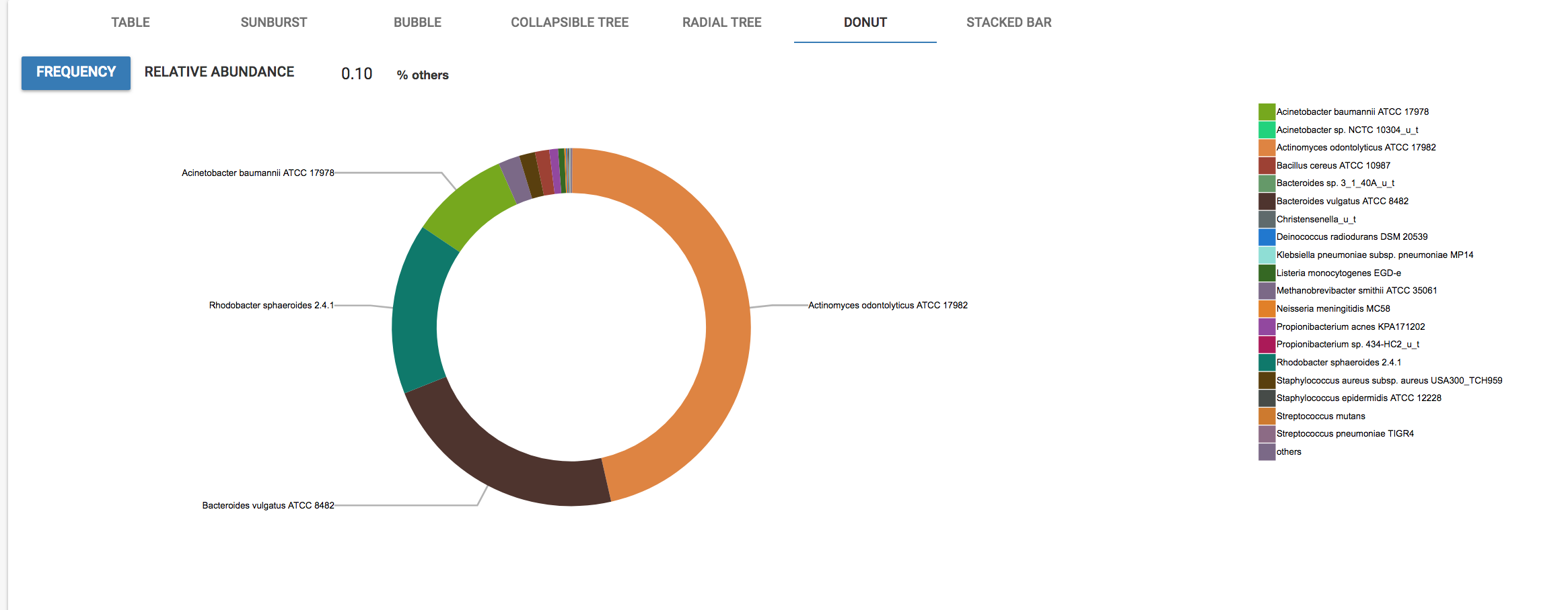
Why use it?
The donut graph is useful for visualizing the relative amounts of each organism in your sample.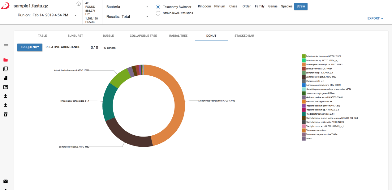
How to use it
You can select different values to use for the donut graphs:- Frequency - Click on “frequency” to use frequency for the donut visualization.
- Relative Abundance - Click on “relative abundance” to use relative abundance for the donut visualization.
- % Others - Enter a number in front of %others to group more or fewer organisms into the “others” category. This is useful if you have many lower abundance organisms and you would like to get a better view of the higher level calls.