Documentation Index
Fetch the complete documentation index at: https://docs.cosmosid.com/llms.txt
Use this file to discover all available pages before exploring further.
Stacked bar graph overview
The stacked bar graph allows you to view the taxonomic breakdown of your samples side by side. Different organisms or taxa are given the same color across the sample bars so you can quickly see how the samples compare.Why use stacked bar graphs?
Stacked bar graphs are great for looking at the distribution of different organisms or taxa across all of your samples at the same time. Using the taxonomic switcher to switch between different taxonomic levels allows you to get a feel for the composition of the samples. For example, if you are interested in a particular genus and the variation in its abundance among the samples you can easily view it in the stacked bar graph.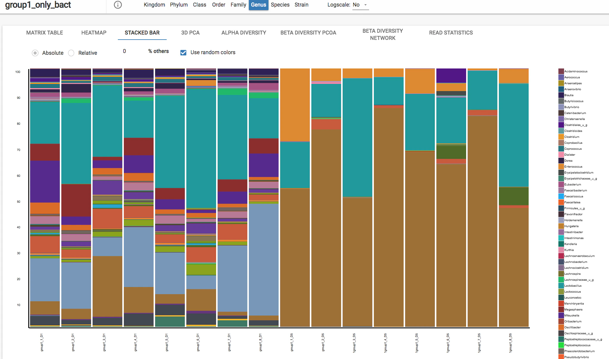
Options for viewing stacked bar graphs
Absolute - the values are used as they are for the stacked bar graph. Relative - the values are scaled to 100% for the stacked bar graph. Switching between Absolute and Scaled - There is a radio button that allows you to switch between absolute and relative abundance depending on the value used for the comparative analysis. If relative abundance is the value that was used, you will not be able to switch between these buttons as relative abundance is already scaled to 100%. If you selected a different value for the matrix, such as frequency, you can switch between absolute and relative abundance. Use Random Colors - You can select the “Use Random Colors” checkbox to change the stacked bar graph to random colors. By default, the colors map based on taxonomy - so that different species that belong to the same genus appear within the same color but with different shades, for example. Selecting “Use Random Colors” can provide better discrimination between organisms. % others - you can adjust ”% others” to exclude the bottom results. For example, if I enter 5 into the ”% others” field, the bottom 5% of calls will not be shown in the heat map. Mouse hover - if you hover your mouse over the stacked bar graph it will show the organism called in that cell, the actual value represented in the graph, and the label that the sample belongs to, if applicable. Scroll - if the stacked bar graph is larger than the screen, use your mouse to horizontally to view more bars. Export - to download the stacked bar graph, click “Export” in the top right corner and select PNG or SVG. Change taxonomy: To change taxonomic levels for organism databases, you can click on the levels on the top bar: