

Module output and customization
- Beta-diversity ordination plot(s): one ordination plot for each method currently available on Cosmos-Hub 2.0 (PCoA, MDS, t-SNE, and UMAP).
- PCoA scree plot: a PCoA-specific plot showing the proportion of distance variation captured by each PCoA axis.
- Beta-diversity Statistical testing (Permanova and Anosim): a heatmap showing statistical support for differences between the groups defined by the grouping variable, one cell per pairwise comparison.
- Statistical output tables (5): the data behind the PCoA ordination and scree plot, plus the PERMANOVA and ANOSIM results for the overall and pairwise group comparisons.
Beta-diversity ordination plot(s)
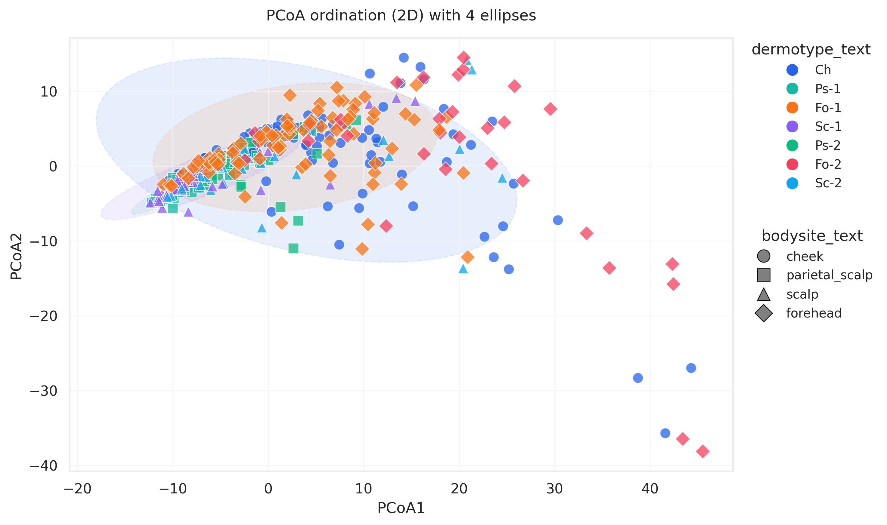
Beta-diversity ordination. Each point is one sample, colored by sex_text (male/female) and shaped by hiv_serostatus_text (positive/negative). Ellipses summarize the spread of the sex groups, showing whether they separate or overlap.
- Each point represents one sample: the distance separating two points in the ordination plot is proportional to how different their microbial feature profiles are. When working with taxonomic profiles, distance tells you how similar their microbial communities are. When looking at functional profiles, it tells you how similar their functional profiles are.
1. Choose how to measure sample distances.
Choose the method used to calculate the sample-to-sample pairwise distance matrix from the Beta-diversity metric dropdown. This choice is important, as it actively changes how the distance matrix used by the ordination methods for plotting is generated. Different beta-diversity metrics can lead to profoundly different ordination plots.A few of the most popular metrics include:
- Bray-Curtis: for relative-abundance data, when you want differences in composition to be weighted by how abundant each taxon is. It is a popular, intuitive default.
- Jaccard: specific for presence/absence data. Useful when you care about which taxa are shared or not shared, regardless of their abundance.
- Aitchison: when you want to keep into account the compositional nature of sequencing data. Because sequencing measures relative, not absolute, abundances, an apparent rise in one taxon can just reflect a drop in another, which can create spurious patterns.
Mean: the geometric mean of the sample (the standard CLR choice). Best when the data is fairly clean.Median: more robust to outliers and noisy low-abundance taxa, often useful for sparse data.
2. Customize the ordination plot
Once distances are computed, these parameters control how the plot is built and annotated:-
From your categorical metadata variables, choose one of interest from the Grouping Variable parameter dropdown. Data points in the ordination plots are assigned different colors depending on which group of that variable they belong to. This is the main way to visually inspect whether the variable you chose (treatment, body site, and so on) displays any pattern in the community structure.
Choice of the Grouping Variable governs between which groups PERMANOVA/ANOSIM testing is done. - Overlay a second categorical variable as point shape using the Shape Variable parameter. This is useful to keep track of another categorical variable (for example, Treatment encoded as the Grouping variable + Timepoint encoded as the Shape variable).
- Choose to display the ordination plot in 2D or 3D: change the Number of Components parameter. A 2D ordination plot is usually the best choice to maintain readability of the plot, but a 3D plot can be useful when the first two components do not capture enough of the variation, so an important separation between groups stays hidden in 2D but becomes visible once a third axis is added.
- The Max ellipses and Confidence level parameters control the group ellipses drawn on the plot, which summarize where each group of samples sits and how spread out it is.
- Drop samples with missing grouping metadata removes samples that have no value for the grouping variable, keeping the plot and the comparison clean.
Why it’s useful
- Explore overall similarity: close samples have similar communities; distant samples differ.
- Assess whether your metadata explains community structure: color samples by a variable (treatment, disease status, body site, and so on) and check whether it lines up with visible patterns. If the groups are mixed, that variable may not explain much of the variation; if they cluster or separate, it may be associated with community differences, but first rule out study-design or technical variables (batch, cohort, sampling site).
- Spot batch or technical effects: if samples cluster by sequencing batch, study site, run, extraction method, processing date, or cohort, consider this before reading the pattern as biology.
- Detect outlier or suspicious samples: samples expected to be similar (replicates, or longitudinal samples from one subject) should sit close together. If one clusters with an unrelated subject, it may be a true biological shift, or a sample swap, label mismatch, contamination, or processing issue worth checking.
3. Statistical testing
The ordination plot shows whether your groups appear to separate. Statistical testing checks whether that separation is real or could be due to chance. The module runs two permutation tests, PERMANOVA and ANOSIM, for every pair of groups in your grouping variable. Both use the same distance matrix as the ordination plot, so the test and the plot describe the same differences between samples.- The Grouping Variable defines the groups being compared. It is the same variable you used to colour the plot, so the visual pattern and the statistical result refer to the same groups.
- The Number of permutations controls the precision of the p-value. With 999 permutations, the smallest p-value the test can return is 0.001. More permutations give a more precise p-value and take longer to run.
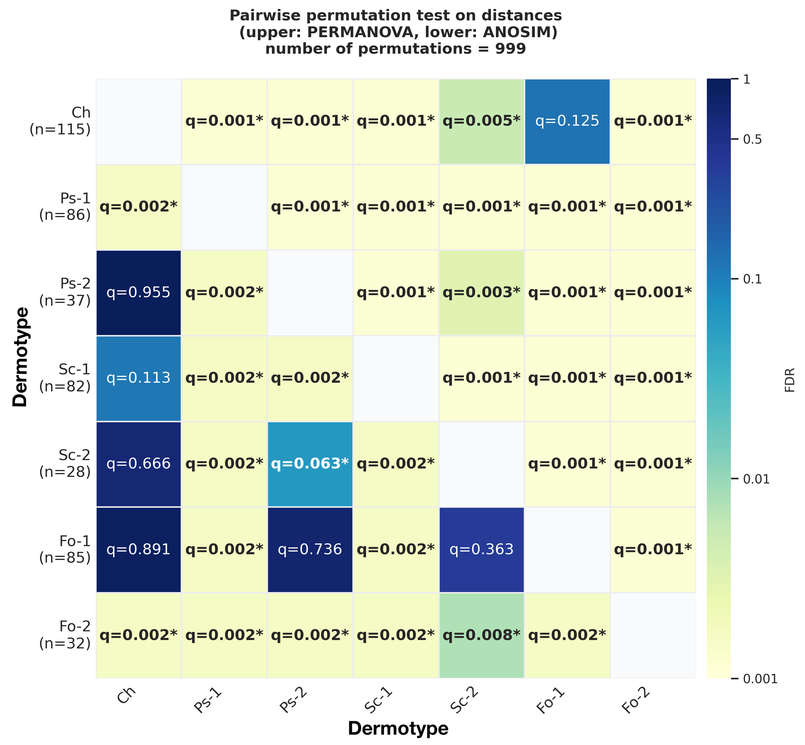
Pairwise PERMANOVA and ANOSIM results for dermotypes in skin samples, with 999 permutations. The lower triangle shows PERMANOVA results. The upper triangle shows ANOSIM results. Each cell shows the FDR adjusted q-value for one pair of dermotypes. An asterisk marks a significant comparison. Darker cells indicate lower q-values on a log scale. Numbers in parentheses on the y-axis show the sample size of each dermotype.
- PERMANOVA tests whether the centroids of the groups differ. A centroid is the average position of a group’s samples in the space defined by the distances. The test statistic, pseudo-F, compares distances between groups with distances within groups, in a similar way to ANOVA. PERMANOVA works on the actual distance values.
- ANOSIM ranks all distances from smallest to largest and compares the average rank between groups with the average rank within groups. Its statistic R ranges from about −1 to 1. Values near 0 indicate no separation and values near 1 indicate strong separation.
PCoA scree plot
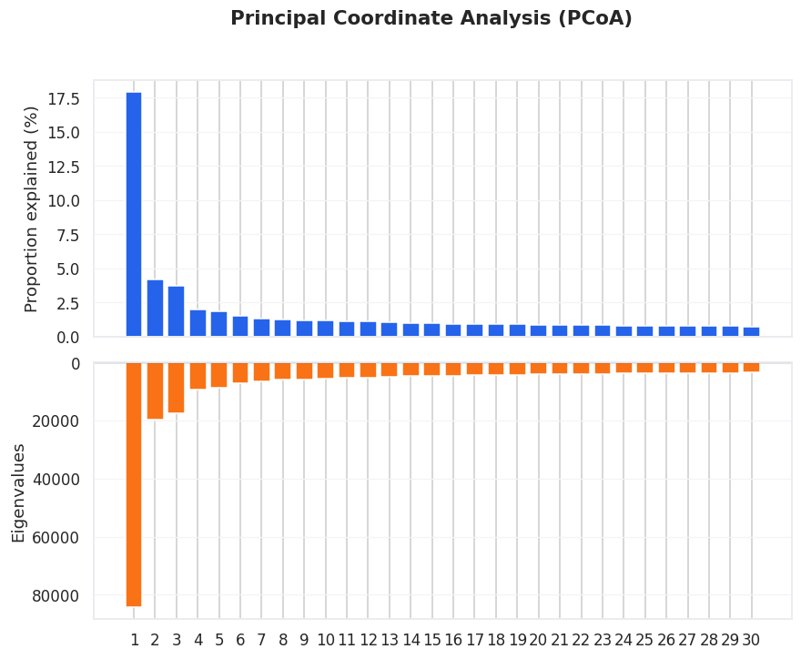
PCoA scree plot. The top panel shows the proportion of variation explained by each axis; the bottom panel shows the corresponding eigenvalues. Axes explaining more variation capture stronger patterns.
- Judge how well the 2D plot summarizes the data: if PCoA1 and PCoA2 explain a large share of variation, the ordination is a strong summary; if they explain only a small share, the plot still helps but represents only part of the full differences.
- See whether differences come from one strong pattern or many: if PCoA1 explains far more than the others, one dominant source separates the samples; if variation is spread across many axes, the differences are more complex and distributed, rather than driven by a single gradient.
Ordination and statistical test tables
Scroll past the of the output page to download intermediate files and statistical summaries of the Beta-diversity Analysis moduleRecommended parameters
- Kepler - Host-Agnostic Taxonomic Profiling (WGS)
- CHAMP - Human Taxonomic Profiling (WGS)
- 16S SR Amplicon Classification - Taxonomic
- 16S LR Amplicon profiling - Taxonomic
- Host-Agnostic Functional Profiling (WGS)
- CHAMP - Human Functional Profiling (GBM, GMM, KEGG)
- AMR/VF - Functional
Parameter reference
Grouping Variable
Grouping Variable
- Options · Categorical variables from the metadata table associated with the query used to create the analysis
- Default ·
None: no grouping is applied, all samples share one color and the plot shows their overall spread without group comparisons. Choose a grouping variable to color samples by metadata and compare groups. - Suggested · A categorical variable relevant to your study design, such as
treatment,disease status,condition,body site,cohort, ortime point. Avoid variables with too many categories or categories represented by very few samples, these clutter the plot and reduce the reliability of statistical testing.
Beta-diversity metric
Beta-diversity metric
- Options · 23 metrics
- Default ·
Euclidean - Suggested · Match the metric to your question and feature type:
Centroid Method
Centroid Method
Aitchison- The Aitchison metric first applies a CLR (centered log-ratio) transformation: within each sample, every feature’s abundance is divided by a single per-sample reference value and then log-transformed, which removes the compositional constraint and makes samples comparable. This parameter chooses which summary statistic is used as that reference value, so it controls how each sample is centered before distances are computed.
- Options ·
mean,median - Default ·
mean - Suggested
mean: the geometric mean of abundances (the standard CLR choice). Best when the data is fairly clean and most taxa carry meaningful signal.median: more robust to outliers and noisy low-abundance taxa, often useful for sparse microbiome data.
Number of Components
Number of Components
-
Options ·
2(2D) or3(3D) -
Default ·
2 -
Suggested:
2: a standard 2D scatter plot: easier to read, annotate, and export, and usually enough when the first two components capture most variation.3: when the first two components don’t capture enough structure, or an extra axis reveals separation hidden in 2D. Shown as a static 3D plot.
Drop samples with missing grouping metadata
Drop samples with missing grouping metadata
-
Default ·
TRUE(samples with missing values are dropped) -
Options:
- Enabled: samples with missing metadata are removed before the analysis runs. The distance matrix, ordination, and tests are computed only on samples with a valid group, keeping comparisons clean.
- Disabled: samples with missing values are kept and assigned to a separate
NaN_group, appearing as their own group and included in calculations.
- Suggested ·
- Enable to compare well-defined groups, run PERMANOVA, or produce a clean publication plot (missing values can otherwise distort group centroids, within-group spread, and test results).
- Disable when it’s useful to see where unlabelled samples fall in the ordination, for example to check whether they cluster with any known group.
Max ellipses
Max ellipses
- Options ·
0to10 - Default ·
0 - Suggested · With few, well-separated groups (≤5), showing all is fine. For more complex datasets, limiting the number improves readability.
Confidence level
Confidence level
- Options ·
50to99% - Default ·
95%
Number of permutations
Number of permutations
- Options ·
99to10000 - Default ·
999 - Suggested · Use
999for standard exploratory analysis. Use4999or9999when results will be reported formally, or when the p-value is close to the significance threshold. Higher values give more precise p-values but take longer.
Shape Variable
Shape Variable
None (all samples share the same shape)Suggested · A categorical variable that adds context, such as sex, cohort, sample type, time point, or body site. For example, with samples colored by treatment, the shape could show which cohort or collection site each came from.References
- Anderson, M. (2014). “Permutational Multivariate Analysis of Variance (PERMANOVA).” Wiley StatsRef: Statistics Reference Online. https://doi.org/10.1002/9781118445112.stat07841
- Jaccard Index. Jaccard, P. (1901). “Étude comparative de la distribution florale dans une portion des Alpes et des Jura.” Bulletin de la Société vaudoise des sciences naturelles, 37(142), 547-579. Jaccard, P. (1912). “The Distribution of the Flora in the Alpine Zone. 1.” New Phytologist, 11(2), 37-50. doi:10.1111/j.1469-8137.1912.tb05611.x
- Bray-Curtis Dissimilarity. Bray, J. R. & Curtis, J. T. (1957). “An ordination of the upland forest communities of southern Wisconsin.” Ecological Monographs, 27, 325-349.