Once you have built and trained an ML classification model, Cosmos-Hub 2.0 provides ways to evaluate its predictive performance and find which microbial features contributed mostly to the prediction.
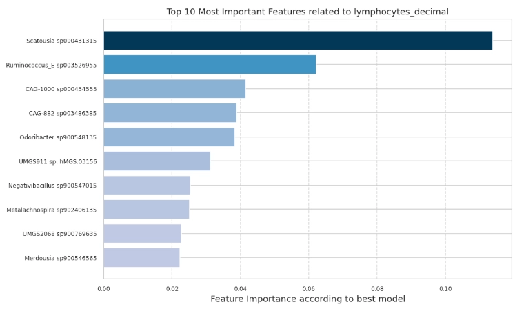
Top microbial features ranked by their contribution to the best-performing model's predictions. Longer bars mean higher relative importance within this run. Importance is for ranking, not effect size, direction, or causality.
This plot answers “which microbial features helped the model predict?” Each bar is one feature used by the best-performing model, ranked from most to least important; longer bars indicate a stronger influence on predictions. The number shown is set by Top features (N).Feature importance is informative only once the model is shown to predict well. When it does, the features it relied on point to the drivers of the classes, and give candidates for validation or follow-up.A high importance means the feature was useful for prediction. It does not say whether the feature is higher or lower in a given group, how large its effect is, or that it causes the outcome. To read direction and magnitude, inspect the taxa abundance across groups separately.
Identifies the features driving predictions: ranks taxa or functions by their contribution, reducing thousands of features to the few most relevant to the target, for validation or follow-up.
Supports interpretability: explains the basis of the model’s predictions, not just its accuracy.
Highlights candidate features for hypotheses: flags the features most associated with the target as starting points for investigation.
Importance scores are model-specific: Different models (random forest, gradient boosting, linear, permutation-based) compute importance with different criteria, so compare scores within the same model and run, never across model types. A feature ranked highly by one model may rank differently in another.
Check Model Performance before interpreting Feature ImportanceA high Feature Importance value means the fitted model relied on that feature for making predictions, but it doesn’t imply how well it made those predictions. A model performing near chance will still assign high importance to some features. First, confirm the classification model is predictive by checking the ROC AUC, PR AUC, and confusion matrix. Then use feature importance to understand which features drove that prediction.Performance metrics and feature importance are computed on two different things:
Performance metrics refer to cross-validated, out-of-fold predictions.
Feature importance values refer to the features that contributed most to the best model—the one with optimized hyperparameters—after it is refit on the full dataset.
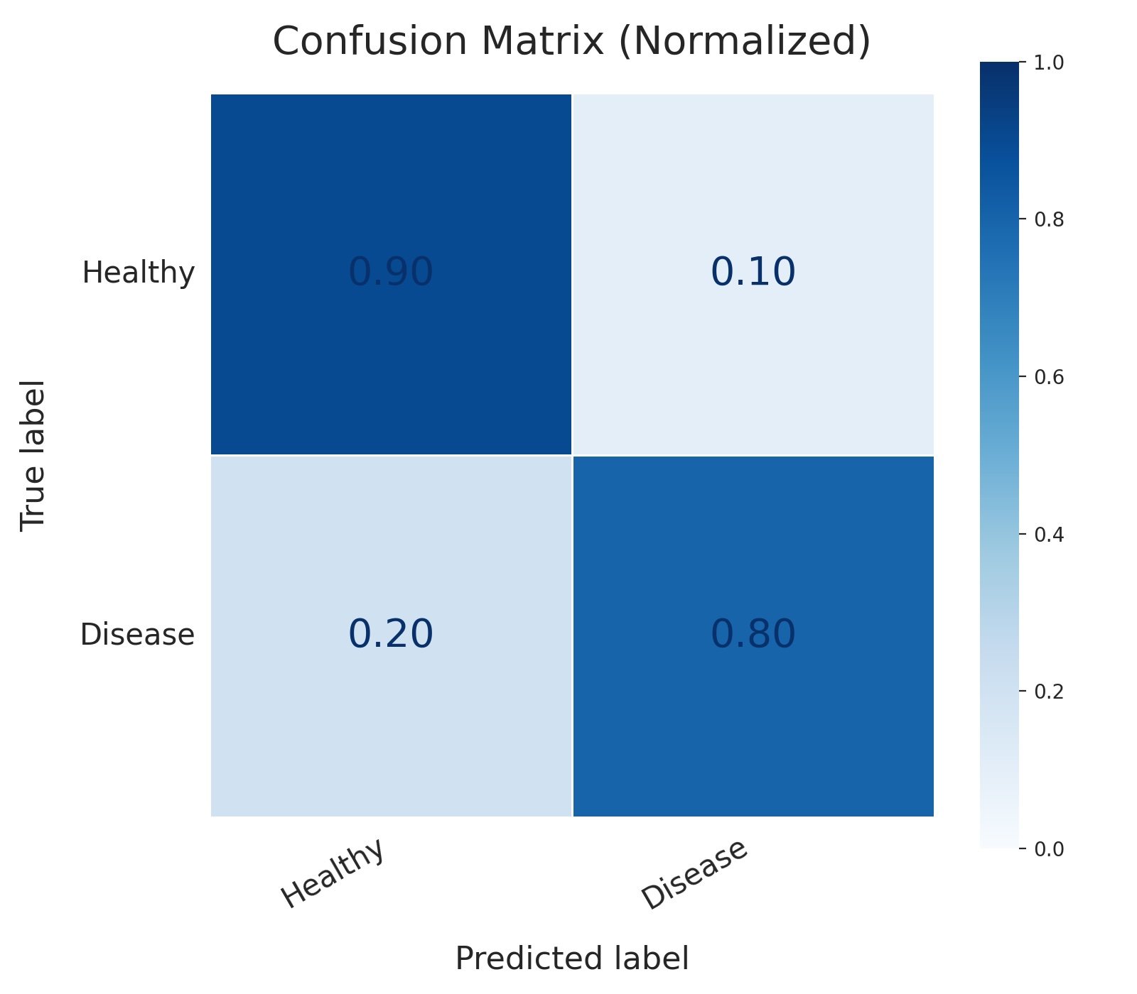
Confusion matrix for a binary classifier predicting healthy vs. disease status, with values normalized by true class. The model correctly identifies 90% of healthy cases and 80% of disease cases (true positive rate/recall). It misclassifies 10% of healthy patients as diseased (false positives) and, more critically, misses 20% of actual disease cases (false negatives), the error with the highest clinical cost in this setting.
After training a machine-learning classifier, we need to check how well it performs on labelled data that was not used to train the model. The model’s predictions are compared with the known class of each sample, and the results are summarized in a confusion matrix.In a confusion matrix, each row represents the true class and each column represents the class predicted by the model. Reading across a row shows how samples from that true class were classified. Correct predictions appear on the diagonal, from the top-left to the bottom-right. Values outside the diagonal represent classification errors.In the example above, the model predicts disease status from microbial profiles. Diseased samples are treated as the positive class, while healthy samples are treated as the negative class. This is only a naming convention, but it defines the four possible outcomes:
True negative (top-left, 0.90): a healthy sample correctly predicted as healthy.
False positive (top-right, 0.10): a healthy sample incorrectly predicted as diseased, a false alarm.
False negative (bottom-left, 0.20): a diseased sample incorrectly predicted as healthy, a missed case.
True positive (bottom-right, 0.80): a diseased sample correctly predicted as diseased.
Because the values are normalized within each true class, every row sums to 1. The first row therefore means that 90% of healthy samples were correctly classified as healthy, while 10% were classified as diseased. The second row means that 80% of diseased samples were correctly identified, while 20% were missed.This distinction matters because false positives and false negatives may have very different consequences. In a clinical screening setting, for example, missing a diseased sample may be more serious than flagging a healthy sample for further testing. The confusion matrix makes both types of error visible, helping you judge whether the model’s performance is appropriate for the intended use.
How the confusion matrix values are calculatedThe confusion matrix is based on out-of-fold predictions from stratified k-fold cross-validation. In each fold, the model is trained on the other folds and used to predict the class of the held-out samples. This means that every sample receives one prediction from a model that was not trained on that sample.The predicted labels are then compared with the true labels to count how often samples from each true class were assigned to each predicted class.By default, the matrix is normalized by true class (normalize="true"), so each cell is calculated as:Matrix valuei,j=all samples truly in class isamples truly in class i predicted as class jEach row therefore sums to 1. For example, a value of 0.20 means that 20% of the samples belonging to that row’s true class were assigned to the corresponding predicted class.
Why it’s useful
Exposes per-class performance: shows whether the model handles both classes well or leans toward one, which a single accuracy score cannot reveal.
Separates the two error types: distinguishes false positives from false negatives, so you can weigh them against the real-world cost of each in your study.
Grounds the other metrics: the ROC and precision-recall curves below are derived from these same outcomes, so the matrix is the plain-numbers view that makes them easier to interpret.
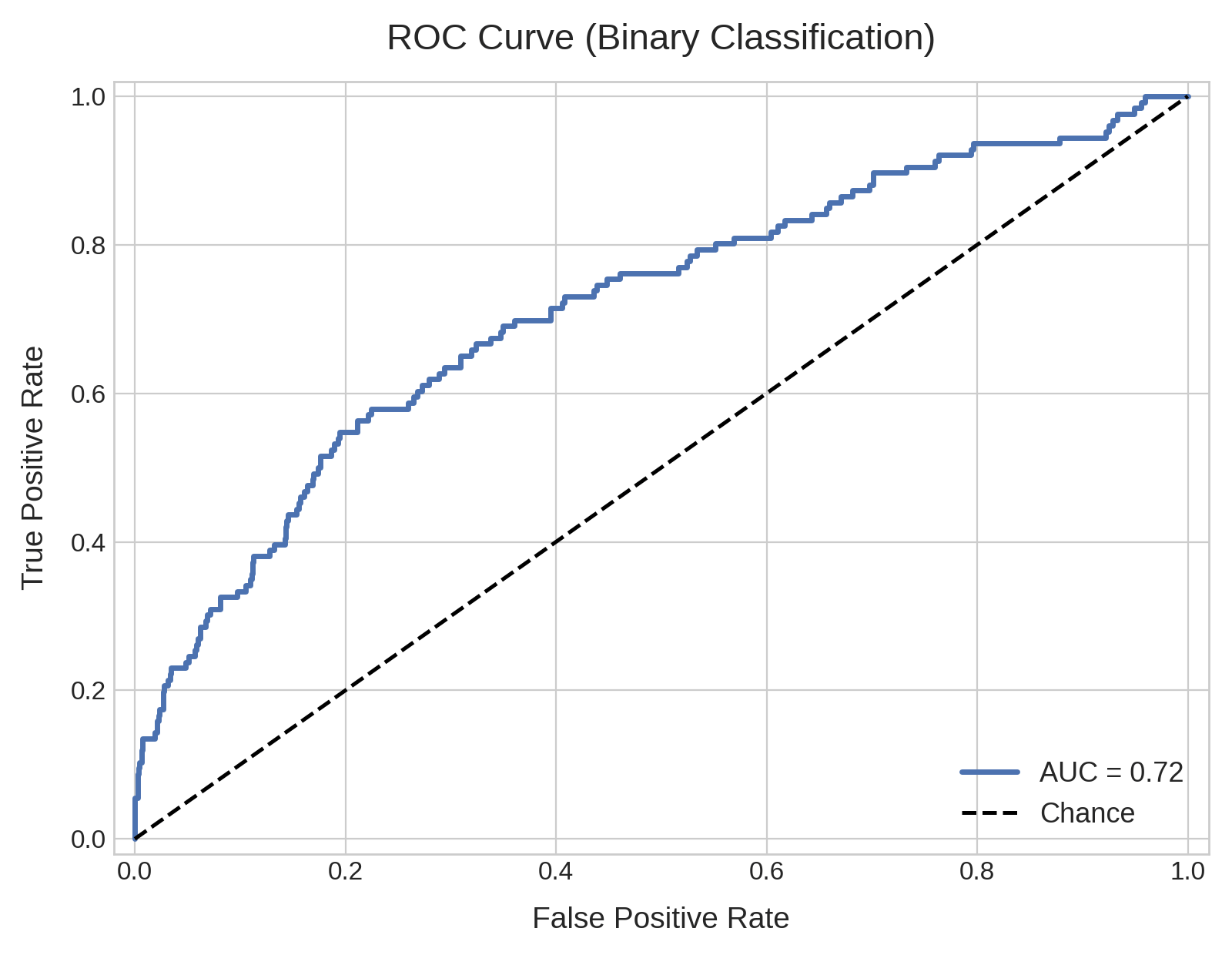
ROC curve for a binary classifier on an imbalanced dataset (10% positive class), plotting true positive rate against false positive rate across thresholds. AUC is 0.72, well above the 0.50 chance line. Despite this solid-looking AUC, precision remains low in practice (see the companion PR curve), since ROC can overstate performance when positives are rare.
What does the ROC curve represent about the ML classifier?
A ROC curve measures how well a classifier separates two (for example healthy vs disease, male vs female) or more classes (for example different disease stages, body sites, ethnicity) of your Target Variable.When a classifier predicts the target, it does not return a fixed label. It assigns each sample a probability of belonging to the positive class (for example, 0.80 for disease and 0.20 for healthy), and a threshold converts that probability into a label: above the threshold the sample is called positive, below it negative.Where the threshold is set changes the prediction, and it trades off two kinds of error:
A low threshold labels more samples positive. It catches more true positives (real disease cases correctly flagged) but also produces more false positives (healthy samples wrongly flagged).
A high threshold does the opposite: fewer false positives, but some real cases are missed.
Which error matters more depends on the application. A screening test may tolerate more false positives to avoid missing cases, while a test that triggers an invasive follow-up may keep false positives low.The ROC curve displays this trade-off across all possible threshold values. It plots the true positive rate (the fraction of actual positives correctly identified) against the false positive rate (the fraction of actual negatives wrongly flagged). Each point on the blue curve (1) corresponds to one threshold.
The area under the curve (AUC) is a single value that summarizes the whole ROC curve, between 0 and 1. It can be read as the probability that the model assigns a higher positive-class score to a randomly chosen positive sample than to a randomly chosen negative one. An AUC of 0.85, for example, means that in about 85% of positive-negative sample pairs the positive sample is ranked higher.The shape of the curve reflects the same thing:
Good classifier: the ROC bends sharply toward the top-left corner, reaching a high true positive rate while the false positive rate is still low. Its AUC approaches 1.0.
Bad classifier: when the ROC curve is close to the diagonal, the AUC approaches 0.50. As the threshold moves, the two rates rise together and the model separates the classes no better than chance.
Too good to be trueAn AUC close to 1.0 on microbiome data means the microbial profiles separate the classes almost perfectly. Near-perfect separation is uncommon in microbiome studies, so it should prompt a check for technical confounders, such as batch effects, differences in sequencing depth between groups, or leakage between the training and test sets, before it is interpreted as biology. Known background factors can be adjusted for with Covariates.
Why ROC can look good on imbalanced dataWhen the positive class is rare, a model can reach a high ROC AUC while still flagging many negatives for each true positive it finds, so precision can stay low. For example, in a cohort of 100 samples with only 10 diseased, a model might correctly flag 9 of the 10 cases but also wrongly flag 18 of the 90 healthy samples. The false positive rate stays low (18 of 90 = 20%), so the ROC curve still looks strong. Yet of the 27 samples flagged as diseased, only 9 are truly positive, a precision of just 33%.The precision-recall curve, described next, makes this visible.
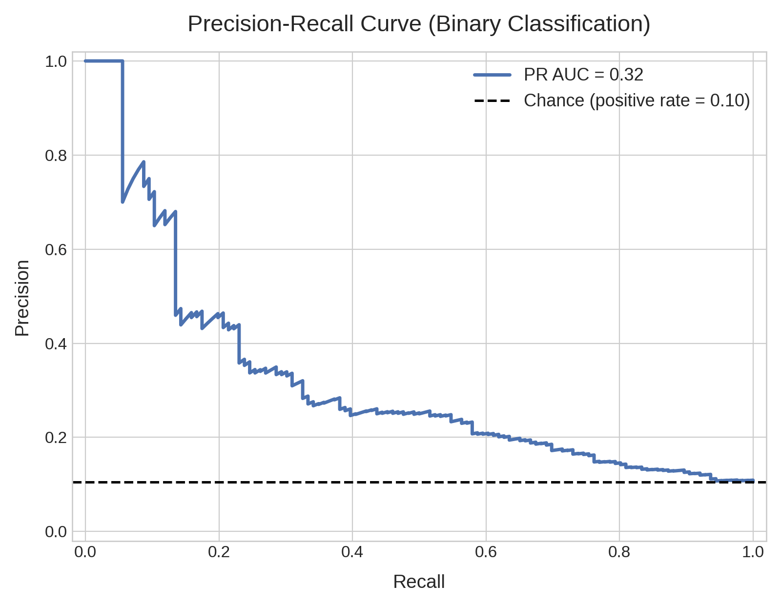
Precision-recall curve for the same classifier and imbalanced dataset (10% positive class) as the ROC curve above, plotting precision against recall across thresholds. The dashed line marks the 0.10 baseline set by the positive class prevalence, the precision a no-skill model would reach. Read the PR AUC against this baseline, not against 0.50.
What does the PR curve represent about the ML classifier?
Like the ROC curve, the PR curve summarizes performance across all probability thresholds.Instead of the true and false positive rates, the axes represent Precision (y-axis) and Recall (x-axis), two measures that emphasize the model predictive performances on the positive class:
Precision
Of the samples the model predicts positive, the fraction that are truly positive. When the model calls a sample diseased, how often is it right?Precision=TP+FPTP
Recall
Of the actual positive samples, the fraction the model correctly identifies. Of all the real disease cases, how many did the model find?Recall=TP+FNTP
Precision and recall trade off against each other. Lowering the threshold labels more samples positive, which raises recall but usually lowers precision, since more of the flagged samples turn out to be false positives. Raising the threshold does the opposite. The PR curve in blue displays this trade-off.
Similarly to the AUC, also the PR curve is summarized as a single number between 0 and 1: the area under the curve, or PR AUC. On Cosmos-Hub 2.0 this is computed as the Average Precision (AP), the mean precision across thresholds weighted by the gain in recall at each step, rather than by geometric integration of the curve.The shape of the curve reflects the same thing:
A good classifier keeps precision high as recall increases, so the curve stays near the top and bends toward the top-right corner. Its PR AUC approaches 1.0.
A poor classifier loses precision quickly as recall rises, so the curve drops toward the baseline. Its PR AUC approaches the baseline value.
Read PR AUC against the class prevalence, not 0.50. Unlike the ROC diagonal, which always sits at 0.50, the ‘no-skill’ baseline of a PR curve equals the prevalence of the positive class, the fraction of samples that are positive.For a dataset with 10% positives, the baseline is 0.10 (the dashed line) so a PR AUC near 0.10 means no skill and only values well above it indicate real signal. This is why the PR curve is more informative than the ROC curve when the positive class is rare.
It focuses on the positive class, so it reflects performance where positives are rare and the ROC curve can look overly optimistic.
It shows the precision you can expect at a given recall, which maps directly to a decision: how many flagged positives are real if you want to catch a given fraction of the cases.
It provides a single comparable number, the PR AUC, for ranking models trained on the same data, read relative to the class prevalence.
Under the hood: how the ROC and PR curves are calculated on Cosmos-Hub 2.0Both the ROC and the PR curves are based on out-of-fold predicted probabilities from stratified k-fold cross-validation.In each fold, the model is trained on the other folds and estimates class probabilities for the held-out samples. Every sample therefore receives one probability estimate from a model that was not trained on that sample.For binary classification (eg.: healthy vs diseased), each curve is traced by sweeping a threshold across the positive-class probabilities and recording the relevant pair of metrics at each step: the true positive rate and false positive rate for the ROC curve, and precision and recall for the PR curve. The ROC AUC is computed from these points, and the PR AUC as the Average Precision (the recall-weighted mean of precision).For multiclass classification (e.g: Stage I vs Stage II vs Stage III), the same calculation is performed one-vs-rest for each class, treating one class as positive and all others as negative in turn.
Exporting the ML Classification module output downloads all plots, ML performance summary tables, and the input/output metadata and data tables for the analyzed cohort.
Cross-validated performance metrics for the selected classification model. Metrics are calculated from out-of-fold predictions, so each sample is evaluated by a model that was not trained on that sample.
Column
Description
accuracy
Proportion of samples assigned to the correct class. Higher is better.
precision
Weighted-average proportion of predicted class assignments that are correct. Higher values mean fewer false positives.
recall
Weighted-average proportion of true class members correctly identified. Higher values mean fewer false negatives.
f1_score
Weighted average of the balance between precision and recall. Higher is better.
support
Total number of samples evaluated.
roc_auc
Area under the ROC curve: how well the model distinguishes the true class from other classes across thresholds. Higher is better; 1 is perfect and 0.5 is random ranking.
pr_auc
Area under the precision–recall curve. Higher values indicate a better balance between precision and recall across thresholds.
macro_auc
Average ROC AUC across classes, giving every class equal weight.
micro_auc
ROC AUC calculated across all samples and classes together, giving more weight to common classes.
classification_report
Per-class precision, recall, F1 score, and support, plus macro and weighted averages.
Ranked list of the input features that contributed to predictions made by the selected regression model. Each row represents one feature, ordered from highest to lowest importance.