Once you have built and trained an ML regression model, Cosmos-Hub 2.0 provides ways to evaluate its predictive performance and find which microbial features contributed mostly to the prediction.

Module output and interpretation

The regression module produces five plots, four that measure how well the model predicts and one that reports which features it used.
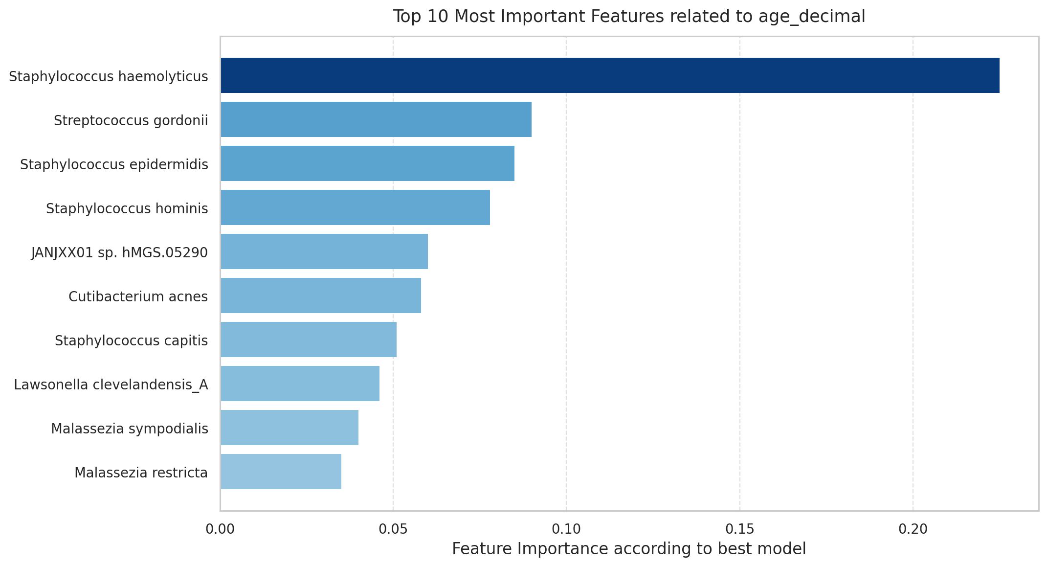
  • Feature importance barplot: which microbial features the model relied on most to make its predictions.
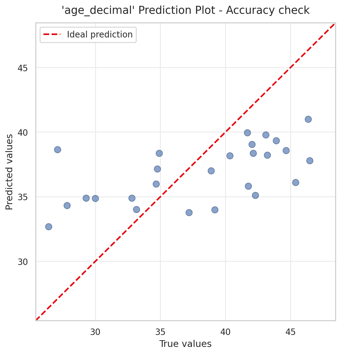
  • Prediction plot: how close the predicted values are to the true values overall.
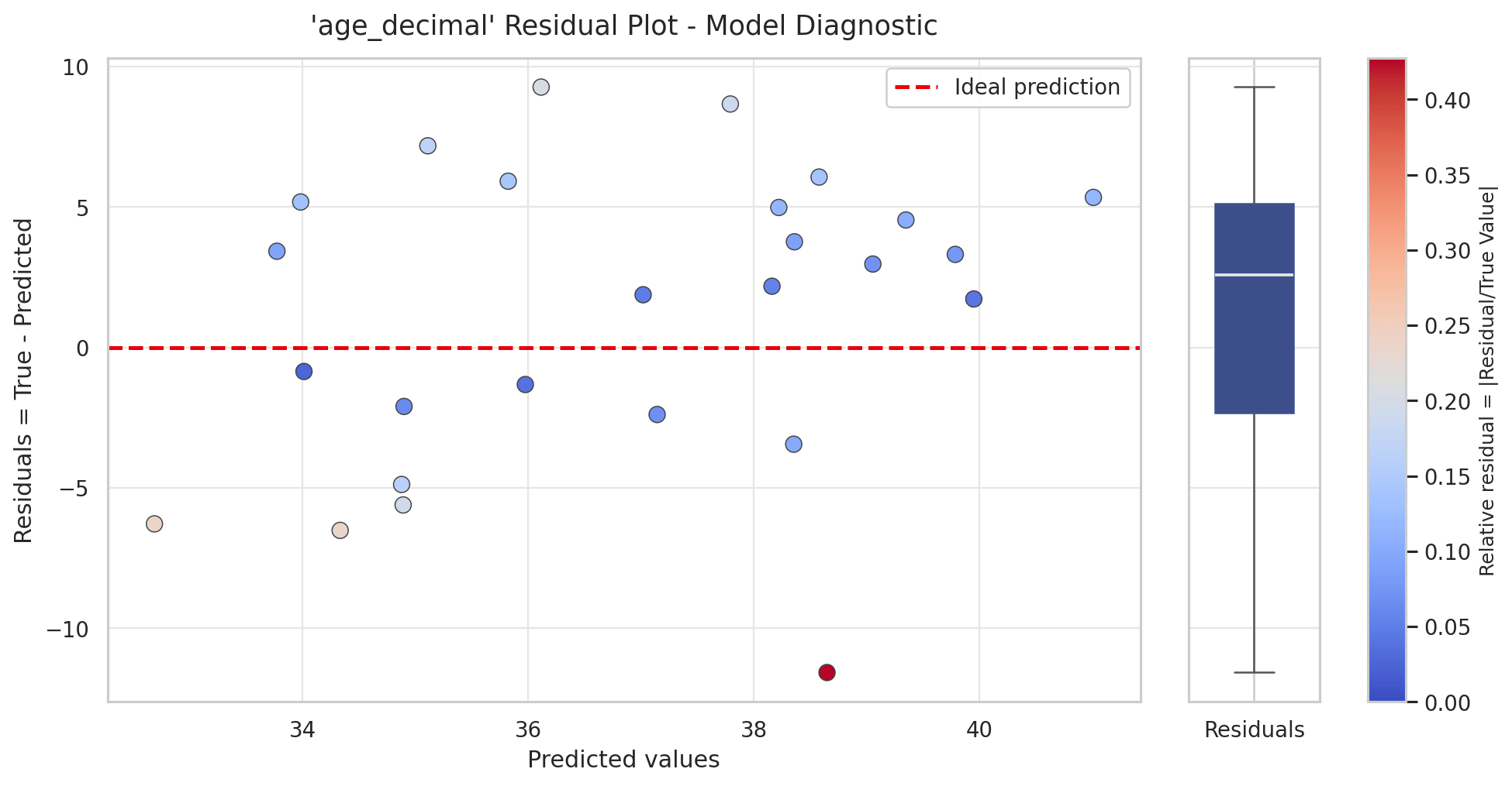
  • Residual plot: where the model’s errors fall, and whether they depend on the predicted value.
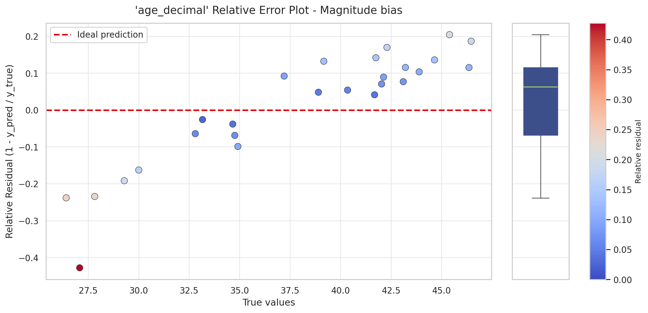
  • Relative error plot: whether errors are proportionally larger at low or high true values.
  • Q-Q plot of residuals: whether the errors follow the expected pattern, or whether some samples are predicted far worse than others.
Read the prediction plot and the diagnostic plots first (the prediction plot, then the residual, relative error, and Q-Q plots) to confirm the model predicts well, and read the feature importance last.

Feature importance

Feature Importance ML

Top microbial features ranked by their contribution to the best-performing model's predictions. Longer bars mean higher relative importance within this run. Importance is for ranking, not effect size, direction, or causality.

This plot answers “which microbial features helped the model predict the target?” Each bar is one feature used by the best-performing model, ranked from most to least important; longer bars indicate a stronger influence on predictions. To decide how many features should be displayed, in decreasing order of feature importance set Top features (N) parameter. A high importance means the feature was useful for prediction. It does not say whether higher abundance pushes the predicted value up or down, how large the effect is, or that the feature causes the outcome. To read direction and magnitude, plot the feature’s abundance against the target separately. Feature importance is informative only once the model is shown to predict well. When it does, the top features are the taxa or functions whose abundance best tracked the target value, and they give candidates for validation or follow-up. In the example above, predicting age, the top features are skin-associated taxa such as Staphylococcus, Cutibacterium acnes, and Malassezia, consistent with a skin microbiome dataset.

Why is this plot useful?

  • Identifies the features driving predictions: ranks taxa or functions by their contribution, reducing thousands of features to the few most relevant to the target, for validation or follow-up.
  • Supports interpretability: explains the basis of the model’s predictions, not just its accuracy.
  • Highlights candidate features for hypotheses: flags the features most associated with the target as starting points for investigation.
Importance scores are model-specific:

Different models (random forest, gradient boosting, linear, permutation-based) compute importance with different criteria, so compare scores within the same model and run, never across model types. A feature ranked highly by one model may rank differently in another.
Check performance before reading importance:A high importance means the fitted model relied on that feature, not that the model predicts well. A model performing near chance still assigns high importance to some features. Confirm the model is predictive first, using the prediction plot and the residual diagnostics, then use feature importance to understand which features drove that prediction.The two are computed on different objects: the performance is measured from cross-validated out-of-fold predictions, while importance is computed after the selected model is refit on the full dataset. Importance therefore describes the final model, not its held-out generalization, which is another reason to read it together with the diagnostic plots rather than on its own.

Prediction plot

Prediction plot: true vs predicted values

Prediction plot for a model predicting age (age_decimal). Each point is a sample, with the true value on the x-axis and the model's predicted value on the y-axis; the dashed red line marks perfect prediction. In this example the points form a shallower slope than the line: low ages are over-predicted and high ages under-predicted, so the model pulls its predictions toward the middle of the range.

The prediction plot is the first check of how well the model predicts. Each point is a sample: the x-axis is its true value and the y-axis the value the model predicted. The dashed red line is perfect prediction, where predicted equals true.
  • Points on the line were predicted exactly.
  • Points above the line were over-predicted; points below were under-predicted.
The tighter the points cluster around the line, the more accurate the model. A common pattern, visible in the example above, is that the points form a shallower slope than the line: low true values are over-predicted and high true values are under-predicted. This means the model pulls its predictions toward the average, a sign it captures only part of the signal. The exact error metrics that quantify this scatter, mean squared error (MSE), mean absolute error (MAE), and the coefficient of determination (R²), are reported in the exported results file (see Exporting the results).

Why is this plot useful?

  • Gives an immediate sense of accuracy: shows how far, and in which direction, predictions fall from the truth.
  • Reveals systematic bias: for example predictions pulled toward the mean, or a consistent over- or under-prediction.
  • Shows where the model works: the range of the target it predicts well versus poorly.

Residual plot
Residual plot: predicted vs residual

Residual plot for the age model. Each point is a sample: the x-axis is the predicted value and the y-axis the residual (true minus predicted), with the dashed line at zero marking perfect prediction. Point colour shows the relative residual (the error as a fraction of the true value), and the boxplot on the right summarizes the spread of residuals.

The residual plot shows where the model’s errors fall. The x-axis is the value the model predicted, and the y-axis is the residual, the true value minus the predicted value. The dashed line at zero marks perfect prediction.
  • Points above the line have a positive residual: the model under-predicted them.
  • Points below the line have a negative residual: the model over-predicted them.
Point colour encodes the relative residual, the size of the error relative to the true value, so a fixed error counts as larger when the true value is small. The boxplot on the right summarizes the spread of residuals across all samples. Read it to check that errors are centered on zero with no trend across the range of predicted values, and to spot samples with unusually large errors.
How the residuals are calculatedResiduals are computed from out-of-fold predictions from k-fold cross-validation: each sample’s predicted value comes from a model that was not trained on that sample. The residual is the true value minus this predicted value. The prediction, relative error, and Q-Q plots are built from the same out-of-fold predictions.

Why is this plot useful?

  • Shows whether errors are unbiased: if the points scatter evenly around zero, the model is not systematically over- or under-predicting.
  • Reveals range-dependent accuracy: a trend across the x-axis means the model is more accurate for some predicted values than others.
  • Flags individual samples: points far from the line, or coloured for a high relative residual, are candidates to inspect separately.

Relative error plot
Relative error plot: true value vs relative residual

Relative error plot for the age model. The x-axis is the true value and the y-axis the relative residual, so each error is expressed as a fraction of the true value. In this example, low ages carry large negative relative residuals (strong over-prediction) and high ages positive ones (under-prediction), the magnitude bias expected when a model pulls predictions toward the mean.

The relative error plot shows the same errors as a fraction of the true value, rather than in absolute units. The x-axis is the true value; the y-axis is the relative residual, 1 − predicted / true, which equals the residual divided by the true value. This matters because a fixed error means different things at different scales: being off by 2 years is minor at age 45 but large at age 5. The relative error plot makes this scale-dependence explicit.
  • A positive relative residual means the sample was under-predicted; a negative one means it was over-predicted.
  • A trend across the x-axis reveals magnitude bias. In the example, low true values carry large negative relative residuals (over-prediction) and high true values positive ones (under-prediction), so the largest relative errors sit at the low end of the range.

Why is this plot useful?

  • Puts errors on a comparable scale: a 2-unit error is judged relative to the true value, not in absolute terms.
  • Exposes bias at the extremes: shows whether the model is proportionally worse for small or large targets.
  • Complements the residual plot: the residual plot shows absolute error, this one shows error relative to size.

Q-Q plot of residuals
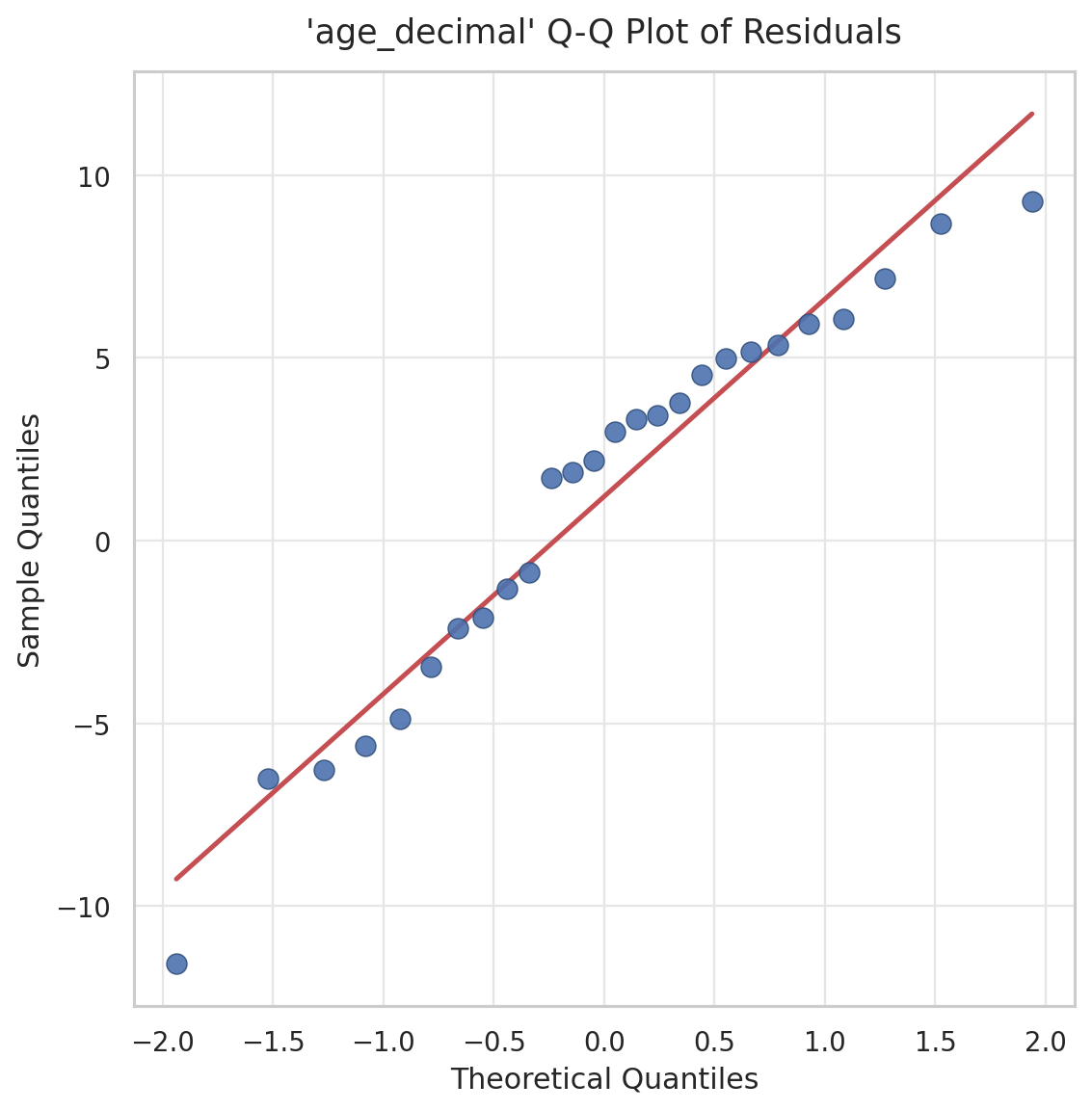
Residual Q-Q Plot

Q-Q plot of the residuals for the age model. Sample residual quantiles (y-axis) are plotted against the quantiles expected from a normal distribution (x-axis), with the red reference line for perfectly normal residuals. The points track the line closely, indicating the residuals are approximately normal.
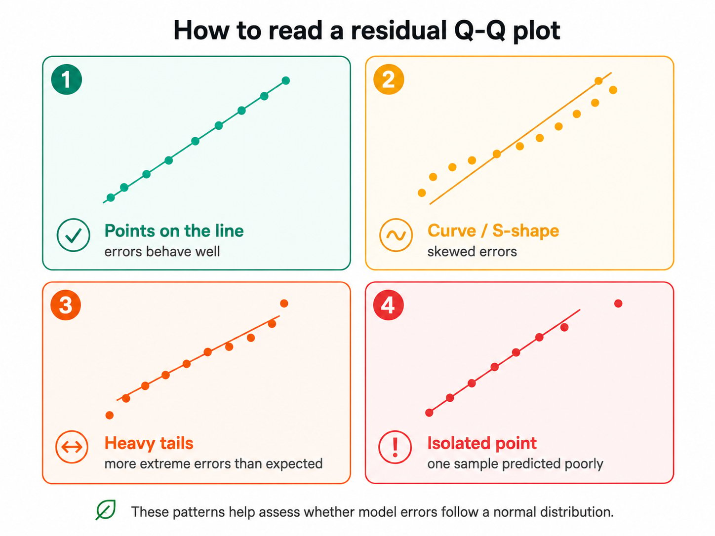
The Q–Q (quantile–quantile) plot compares the distribution of the model’s residuals with a normal distribution. Use it as a diagnostic for the shape of the error distribution. Points close to the reference line indicate that residuals are approximately symmetric and normally distributed. Departures from the line can reveal skewed errors, heavy tails, or individual samples with unusually large prediction errors.
Reading Residual Qq Plot

The four patterns a residual Q-Q plot can show.

Use these patterns to flag poorly predicted samples, spot biological outliers, and decide whether the model or the data needs revisiting.

Exporting the results

Exporting the ML Classification module output downloads all plots, ML performance summary tables, and the input/output metadata and data tables for the analyzed cohort.

Machine Learning Module Results (ml_results.csv)

Cross-validated performance metrics for the selected regression model. Each metric is calculated from out-of-fold predictions: every sample is predicted by a model that was not trained on that sample. This provides a more realistic estimate of how the model may perform on new data.

Feature Importance (ml_feature_importance.csv)

Ranked list of the input features that contributed to predictions made by the selected regression model. Each row represents one feature, ordered from highest to lowest importance.