

Module output and customization
- PCA biplot: a customizable biplot summarizing how samples relate to each other, with options for how it is displayed.
PCA Biplot
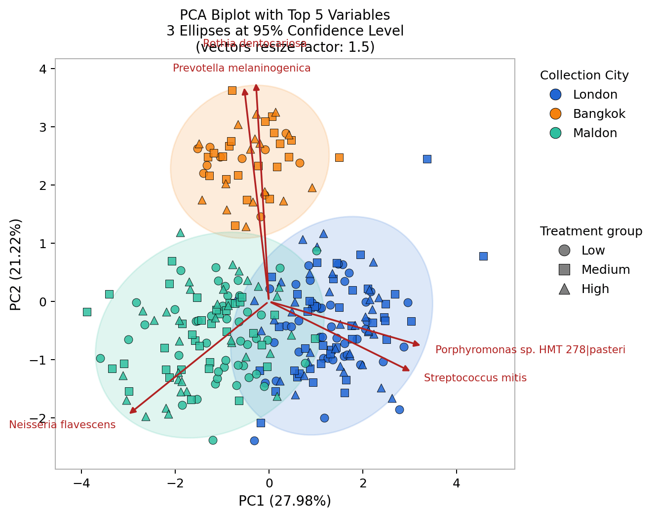
PCA biplot. Each point is one sample along PC1 and PC2, with the variance explained shown on each axis. Color is the Grouping Variable, shape is a second metadata variable, and red vectors are the selected feature loadings.
Sample points and grouping
Each point of the plot represents a single sample of the cohort. By encoding categorical variables of interest (e.g: sample source, health status, treatment group) to different colors and shapes you can visualize whether samples from different groups differ in terms of overall microbial community.Color by one categorical variable
Choose the main categorical variable of interest using the Grouping Variable parameter to encode grouping with colors. This shows whether samples from different groups (e.g: Sample source, Treatment group, Gender) occupy different regions of the plot. This lets you visually assess whether there’s any difference in compositional pattern between your cohorts.Add a second variable with shapes
Overlay a second categorical variable using the Shape Variable parameter. This is useful when two factors might both influence the data: for example, coloring points by treatment and shaping them by cohort lets you see whether the separation follows treatment, cohort, or both, without needing a second plot.Handling missing metadata
Samples with missing values in the grouping variable can be excluded using Drop samples with missing metadata.Group ellipses
Ellipses can be drawn around each group’s points to summarize where the group sits and how spread out it is.Adding group ellipses
The Max ellipses parameter sets how many ellipses are shown. Ellipses make overlap or separation easier to judge than scattered points alone, giving a quick visual summary of how distinct the groups are.Setting the ellipses area
How large each ellipse is drawn is set by the Confidence level: a higher value draws a wider ellipse that covers more of the group’s samples, a lower value a tighter one. Adjusting it changes only how the spread is drawn, not the underlying PCA, so treat the ellipses as a visual summary of group position and variability, not as a strict boundary.Loading vectors
The loading vectors describe how much each microbial feature of the data table contributes to each principal component. Loading vectors connect the structure in the plot to specific features, indicating which taxa or functions drive the separation between samples. They are shown as arrows (vectors) overlaid on the PCA plot:- The direction of the arrow indicates which component(s) that feature is associated with.
- The length of the arrow indicates how strongly it influences the separation along those axes.
Include loading vectors
Set the Number of vectors parameter to display the top N contributing taxa or function features.Output tables
Scroll past the the end of the output page and click Download Tables and Images to export the numbers behind the plot.Recommended parameters
Select your workflow. The pre-processing parameters that vary by data type (taxonomic rank, relative-abundance threshold, read depth) are filled in per tab; the analysis parameters are the same across all workflows.- Kepler - Host-Agnostic Taxonomic Profiling (WGS)
- CHAMP - Human Taxonomic Profiling (WGS)
- 16S SR Amplicon Classification - Taxonomic
- 16S LR Amplicon profiling - Taxonomic
- Host-Agnostic Functional Profiling (WGS)
- CHAMP - Human Functional Profiling (GBM, GMM, KEGG)
- AMR/VF - Functional
Parameter reference
Grouping Variable
Grouping Variable
The metadata column used to define sample groups. It colors the points, letting you visually assess whether samples cluster by a biological, experimental, or technical category.Options · Categorical variables from the metadata table associated with the query used to create the analysisDefault ·
NoneSuggested · A categorical variable relevant to your study question, such as treatment, disease status, condition, body site, cohort, time point, or sequencing batch.When no grouping variable is selected, samples are shown without group-based coloring. Use a grouping variable to check whether the main variation is associated with a known sample characteristic: for example, coloring by
treatment shows whether treated and control samples separate, while coloring by batch helps detect technical effects.Drop samples with missing grouping metadata
Drop samples with missing grouping metadata
Whether samples with missing values in the grouping variable are excluded from the plot.Options ·
TRUE or FALSEDefault · TRUE (samples with missing values are dropped)Suggested · Use TRUE when clear group comparisons matter, since it removes samples that can’t be assigned to a group. Use FALSE only when keeping all samples is more important for exploratory visualization.Dropping samples with missing group metadata makes the plot easier to interpret, since every displayed sample belongs to a defined group. If disabled, samples with missing values are assigned to
NaN_group.Number of Vectors
Number of Vectors
The number of feature vectors (loadings) shown in the plot. Vectors indicate which taxa or functions contribute most strongly to the displayed components.Options · Integer from
1 to 10Default · 2Suggested · Use 2 or 3 for a simple, readable plot. Increase it to inspect more features that may contribute to the main patterns.More vectors give more detail but make the plot harder to read. Use few vectors for presentation and more for exploratory analysis.
Max Ellipses
Max Ellipses
The maximum number of group ellipses shown. Ellipses summarize the position and spread of groups defined by the grouping variable.Options · Integer from
0 to 10Default · 0Suggested · Use 0 to hide ellipses, or 1 to 5 to show them for a small number of groups while keeping the plot readable.If the grouping variable has more groups than the maximum, only a subset is shown (by the platform’s plotting order). Ellipses don’t affect the PCA calculation. For example, grouping by
body site can show whether stool, oral, and skin samples occupy different regions.Confidence Level
Confidence Level
The confidence level used to draw group ellipses, which controls their size.Options · Integer percentage from
50 to 100Default · 95Suggested · Use the default for standard visualization. Lower values draw tighter ellipses, higher values draw wider ones.Shape Variable
Shape Variable
An optional metadata column shown as different point shapes, letting you visualize a second characteristic on top of the grouping variable.Options · Metadata variables from the metadata table associated with the query used to create the analysisDefault ·
None (all samples share one shape)Suggested · A categorical variable that adds context, such as sex, cohort, sample type, time point, or body site. For example, with points colored by treatment, the shape could show which cohort or collection site each sample came from.