

What is a heatmap?
A heatmap visualizes the abundance of microbial features, whether taxa or functional features like genes and pathways, across many samples at once. Each row is a feature, each column is a sample, and each cell is color-coded to show how abundant that feature is in that sample. Annotation bars can layer metadata on top for extra context.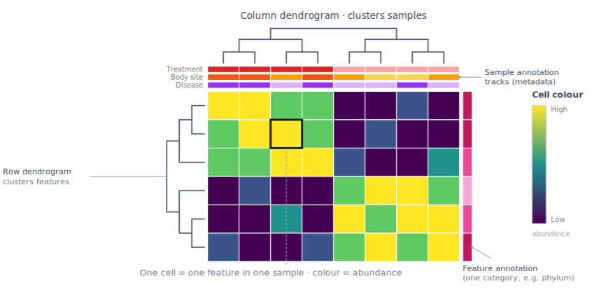
Why is it useful?
A heatmap surfaces patterns across your whole dataset at a glance, patterns that are hard to spot in a table of numbers. Use one to:- Compare groups: see whether one group of patients has higher abundance of specific species or functions than another.
- Spot sample groupings: reveal whether samples from the same body site, treatment, or condition cluster by their microbial profiles.
- Find coordinated features: identify taxa whose abundances move together, hinting at co-occurrence or shared ecological roles.
- Detect enrichment: quickly see which features stand out as especially abundant (or absent) in particular samples.
- Get an overview: condense hundreds of features across many samples into one interpretable picture.