

Module output and customization
- Annotated Heatmap: a highly customizable heatmap to inspect patterns microbial feature abundances across your cohort.
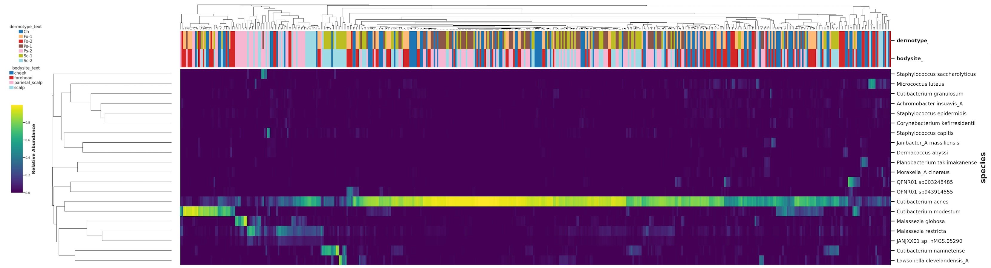
Clustered heatmap of microbial species abundance across skin samples. Species are rows and samples are columns, with both clustered by profile similarity. Colour reports relative abundance, from dark for near zero to yellow for the highest values. The annotation bars above the heatmap label each sample by dermotype and body site, so clusters can be read against the metadata.
Annotated Heatmap
Customize the heatmap cells
The cell is the basic unit of the heatmap. Each cell sits at the intersection of a microbial feature (rows by default) and a sample (columns by default), and its color indicates how abundant that feature is in that sample, with low and high values shown as opposite ends of the color scale.Setting the feature color palette
- Set the color palette for feature abundance using the Feature Color Palette dropdown.
Transforming abundance values
By default, when working with relative abundances (Analysis metric =relative_abundance), the color scale spans the full range (0 to 100%). This is intuitive, but microbiome data usually has a long tail of low-abundance features, where subtle - but informative - compostional patterns between your groups can be overshadowed by the high intensity of the dominant species.
The Value Scaling parameter transforms the values before they’re mapped to color. This is useful to ‘inflate’ low relative abundance values to make it easier to detect differences between low-abundance features:
Samples (column) and features (rows) metadata annotations
Annotations are colored bars above the sample columns that overlay metadata onto the heatmap, so you can track sample characteristics alongside the microbial data.Adding Sample (column) annotations
Use the Sample Annotation parameter to choose which metadata variables to add to the samples. Categorical variables (treatment group, body site, disease status) appear as distinct colors, and numerical variables (age, pH, BMI) appear as a graduated scale. The Drop samples with missing annotation option controls whether samples that lack the chosen annotation are removed.Adding Feature (row) annotations
You can also annotate the features (rows) to add context about the features themselves, such as taxonomic information or other feature-level attributes. Use the Feature Annotation parameter to choose which feature-level variables to display, and Keep features with missing annotation to decide whether unannotated features are kept.Decide how many features to display
A typical dataset can have hundreds or thousands of features, which makes it difficult to display them all on a single heatmap.- Limit how many rows appear by setting the Top features (N) parameter. For example, choosing 10 shows the top 10 features from the full matrix, ordered by your ranking method.
- Decide how features are ranked by choosing a criterion with the Feature Ranking Method parameter. This sorts the features and keeps the top N:
3. Hierarchical Clustering: Ordering and clustering of rows and columns
Clustering reorders rows and columns so that similar profiles sit next to each other, which reveals patterns that a fixed order would hide. The heatmap uses hierarchical clustering, a method that builds a tree (called a dendrogram) grouping samples or features by similarity. The Clustered axis parameter sets whether you cluster columns, rows, both, or neither.- Columns (samples) groups together samples with similar overall profiles. This is useful for seeing whether, for example, treatment and control samples separate. Paired with sample annotations, a cluster that matches a shared trait is a strong cue of a biological pattern.
- Rows (features) groups together features with similar abundance patterns across samples. This is useful for spotting co-occurring taxa that may share ecological niches or interactions.
- Both reorganizes the heatmap so that co-abundant features align with similar samples, revealing blocks, which are sets of features that are characteristically high or low in a particular set of samples. This is often where the most informative patterns emerge, such as a microbial signature specific to a treatment or disease group.
Hierarchical clustering is performed on the top N features.
Choosing the distance metric [Advanced]
Choose how the similarity between pairs of profiles or features should be measured in terms of beta-diversity by selecting Distance metric. To see which distance metrics are supported and how to choose, refer to Beta Diversity on the Cosmos-Hub 2.0Choose the linkage method [Advanced]
Choose Clustering method (linkage), which then sets how clusters are progressively merged into the tree. In hierarchical clustering, linkage defines how the distance between clusters is calculated at each step as they are merged into a tree (dendrogram). Different linkage methods use different rules for “cluster–cluster distance,” for example4. Exporting the heatmap
Scroll to the end of the output page and click Download Tables and Images to export the heatmap in .svg and .png format, and the data table with the numerical input used to plot it.Recommended parameters
Pre-processing
- Kepler - Host-Agnostic Taxonomic Profiling (WGS)
- CHAMP - Human Taxonomic Profiling (WGS)
- 16S SR Amplicon Classification - Taxonomic
- 16S LR Amplicon profiling - Taxonomic
- Host-Agnostic Functional Profiling (WGS)
- CHAMP Functional (GMM, GBM, KEGG)
- AMR/VF - Functional
Heatmap settings
Parameter reference
Sample Annotation
Sample Annotation
One or more metadata columns used to annotate samples, shown as colored bars above the heatmap.Options · Columns from the metadata table associated with the query used to create the analysisDefault ·
NoneSuggested · Variables relevant to the biological question, such as treatment, disease status, body site, cohort, time point, age group, or sex. Annotations help interpret patterns, but selecting too many makes the figure harder to read.Drop samples with missing annotation
Drop samples with missing annotation
Whether samples with missing values in the selected sample annotation are kept in the heatmap.Options ·
TRUE or FALSEDefault · FALSE a default group value is assigned to all features with missing values.Suggested · Use TRUE when the annotation is essential and unannotated samples should be removed. Use FALSE to preserve sample size, or to see where unannotated samples cluster relative to annotated ones.Feature Annotation
Feature Annotation
An annotation used to group or label features (rows).Options · Available feature annotations, depending on the type of profiles in the Data Table (currently available only for taxonomic profiles) Default ·
NoneSuggested · For taxonomic heatmaps, use a higher taxonomic level (phylum, class, family) to annotate lower-level features such as species. .Feature annotations help show whether related features behave similarly, for example annotating species by phylum reveals whether specific taxonomic groups are enriched in certain samples.
Drop Features with missing annotation
Drop Features with missing annotation
Whether features with missing annotation values are kept.
- Options ·
TRUEorFALSE - Default ·
FALSEa default group value is assigned to all features with missing values. - Suggested · Use
FALSEfor most taxonomic analyses, where annotations are usually complete. UseTRUEif missing annotations are expected and you don’t want to drop those features.
If enabled, unannotated features are kept and assigned to a default missing-value group; if disabled, they are removed from the annotated heatmap.
Feature Ranking Method
Feature Ranking Method
The method used to rank features across the whole cohort before the top N are selected for display.
- Options ·
mean,prevalence,variance,percentile - Default ·
mean - Suggested :
percentileis a balanced option for features that are both abundant and informative.- Use
meanto prioritize highly abundant features prevalencefor features seen in many samplesvariancefor features that vary strongly across samples.
Top Features (N)
Top Features (N)
The number of top-ranked features to display.
- Options · Integer from
1to30 - Default ·
10 - Suggested ·
10for a concise, readable heatmap;20to30for a broader exploratory view.
More features give more detail but reduce readability, use fewer for presentation, more for exploration.
Feature Color Palette
Feature Color Palette
The color palette used to display feature values.
- Options · Palettes configured in the platform
- Default ·
viridis - Suggested · Colorblind-friendly continuous palettes such as
viridisfor most heatmaps; alternatives likeinfernowhen stronger contrast is needed.
The palette only affects display, not the underlying data. Choose one that makes high and low values easy to tell apart.
Value Scaling
Value Scaling
Whether values are transformed before plotting.Options ·
None, linear, log2, log10, asinh, clr, presence/absenceDefault · NoneSuggested:None: display values as directly as possible, especially for relative abundance.log2/log10: reduce the visual dominance of highly abundant features.asinh: a log-like transform that handles zero values more easily.clr: a composition-aware transformation.presence/absence: reduces each cell to whether a feature is detected, ignoring how much.
Scaling strongly affects interpretation. Without it, highly abundant features can dominate the color range; with it, lower-abundance patterns become easier to see.
Heatmap Orientation
Heatmap Orientation
Whether features or samples are displayed as rows.
- Options ·
features_rows,samples_rows - Default ·
features_rows - Suggested · Use
features_rowsas standard. Usesamples_rowswhen there are more features than samples, or when it improves readability.
Orientation affects only the layout, not the values or clustering results.
Clustered Axis
Clustered Axis
Which axis is clustered and shown with a dendrogram.
- Options ·
None,rows,columns,both - Default ·
None - Suggested · Use
bothto cluster samples and features;rowsorcolumnsto focus on one dimension;Noneto keep the original order.
Sample clustering can show whether samples from the same condition have similar profiles; feature clustering can reveal taxa or functions that behave similarly across samples.
Distance Metric
Distance Metric
How distances between rows or columns are calculated when clustering is enabled.Options ·
braycurtis, canberra, correlation, cosine, euclidean, jaccard, and othersDefault · euclideanDifferent metrics define community similarity differently and can produce different dendrograms.
Clustering Method
Clustering Method
How distances are converted into a dendrogram (the linkage method).
- Options ·
single,complete,average,centroid,median,ward,weighted - Default ·
single
The linkage method affects the dendrogram shape and the row/column order, but not the underlying values.