Heatmap Overview
For example, in relative abundance data, red highlights organisms with high abundance, yellow indicates medium abundance, and blue shows low abundance.
The heat map assigns “hot” colors (red/orange) to high values and “cold” colors (blue) to low values. These colored cells are displayed on a matrix, helping you easily identify patterns, samples, or taxa of interest.
Why Use a Heatmap?Heat maps are ideal for spotting trends in large datasets, such as identifying organisms consistently abundant in one cohort but not another. This makes them a valuable tool for discovering taxa or patterns worth further investigation.

Heatmap Customization
The heatmap visualization tool provides various modification options to tailor the display to your analysis needs. Below are the customization features available:
Clustering Options
- Sample Clustering: Group samples based on similarities in their feature abundance profiles.
- Cohort Clustering: Organize samples based on predefined cohorts or metadata categories.
- Feature Clustering: Cluster features (e.g., microbial taxa) based on their abundance profiles across samples while also maintaining Cohort Clustering in alphanumeric order.
Most Abundant Features
- Select the number of top-abundant features to display on the heatmap. Adjust the numerical value and click Apply to refresh the visualization.
- Most abundant features are calculated by averaging abundances across all samples (i.e., all cells on the row) and sorts it by largest to smallest.
Color Palette: Choose from predefined color gradients to enhance visual interpretation (e.g., Red-Yellow-Blue: a gradient that transitions from red (high abundance) to blue (low abundance))
Mouse hover: if you hover your mouse over the heat map it will show the organism called in that cell, the actual value represented in the heat map, and the label that the sample belongs to, if applicable.
Scroll: if the heat map is larger than the screen, use your mouse to scroll up and down while hovering over the heat map.
Zoom: The user can left-click and drag creating a highlighted area. The visualization will zoom into this area to allow closer investigation. Double-Clicking will reset the visualization prior to zooming in.
Fit-To-Screen: The fit to screen option alters the visualization to fit the user’s screen. This is useful when processing a large number of metagenomic samples. The visualization by default does not always fit within the page and this allows a concise view.
Export: to download the heat map, click “Export” in the top right corner and select your preferred format:
- TSV: exports the relative abundance table as a tab-separated values file
- PNG, SVG, PDF: exports the heatmap visualization as an image file
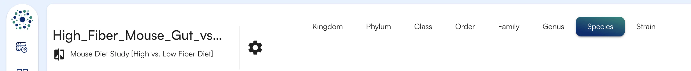
Change taxonomy: To change taxonomic levels for organism databases, you can click on the levels on the top bar:
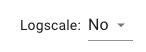
 Logscale: Sometimes it is difficult to discriminate low abundance calls if you have some results that are at a very low abundance and some that are high abundance. In order to better distinguish between low abundance calls, we provide an option to view the log scale version of your data. To view the log base 2 version of your heat map you can do so by selecting “Yes” next to Logscale in the upper menu bar.