Stacked bar graph overview
The stacked bar graph allows you to visualizr the taxonomic breakdown of your samples side by side. Different organisms or taxa are given the same color across the sample bars so you can quickly see how the samples compare.Why use stacked bar graphs?
Stacked bar graphs are great for looking at the distribution of different organisms or taxa across all of your samples at the same time. Using the taxonomic switcher to switch between different taxonomic levels allows you to get a feel for the composition of the samples. For example, if you are interested in a particular genus and the variation in its abundance among the samples you can easily view it in the stacked bar graph.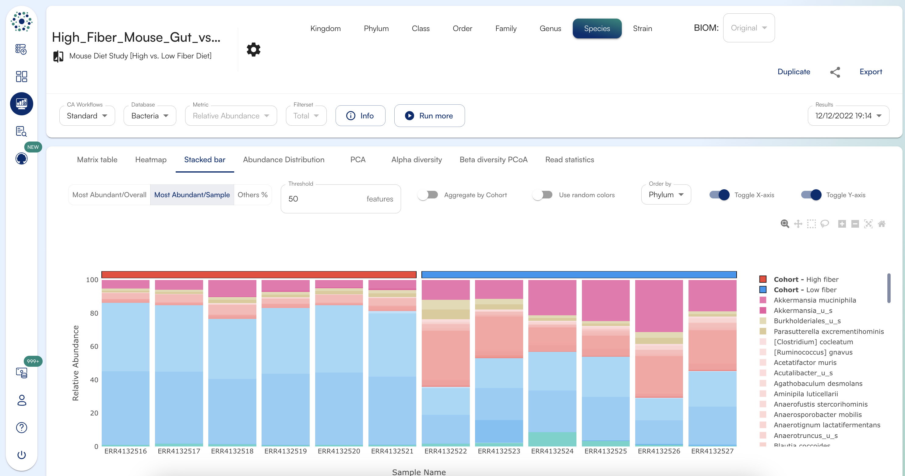
Options for viewing stacked bar graphs
Use Random Colors - You can select the “Use Random Colors” toggle to change the stacked bar graph to random colors. By default, the colors map based on taxonomy - so that different species that belong to the same genus appear within the same color but with different shades, for example. Selecting “Use Random Colors” can provide better discrimination between organisms. Most Abundant - You can adjust “Most Abundant” to visualize the most abundant N organisms per individual samples % others - you can adjust ”% others” to exclude the bottom results. For example, if I enter 5 into the ”% others” field, the bottom 5% of calls will not be shown in the heat map. Mouse hover - if you hover your mouse over the stacked bar graph it will show the organism called in that cell, the actual value represented in the graph, and the label that the sample belongs to, if applicable. Export - to download the stacked bar graph, click “Export” in the top right corner and select PNG, SVG or PDF. Change taxonomy: To change taxonomic levels for organism databases, you can click on the different taxonomic levels on the top bar: Order By You can order the features in the stacked bar chart by Phylum, Alphabetically, Overall Average Score (highest to lowest, lowest to highest) and Cohort Average Score ( Cohort wise highest to lowest, Cohort wise lowest to highest) Logscale: Sometimes it is difficult to discriminate low abundance calls if you have some results that are at a very low abundance and some that are high abundance. In order to better distinguish between low abundance calls, we provide an option to view the log scale version of your data. To view the log base 2 version of your heat map you can do so by selecting “Yes” next to Logscale in the upper menu bar.